Showing posts with label Collaboration. Show all posts

Monday, 27 February 2017

Manly Artists Book Award


The Future of an Illusion detail 


The Future of an Illusion, a collaborative book I made with Jack Oudyn in 2016
has been selected for the Manly Artist Book Award
which takes place at the Manly Library in Sydney from 30th March to 2nd April
followed  by a travelling exhibition of the books that have been acquired.

A post I wrote about the making and meaning of this book can be found here
and Jack also wrote about this book on his blog here.


The judges for this year's award are Dr Michael Hedger, Director of Manly Art Gallery and Museum and Ben Rak an artist and independent curator.

Tuesday, 19 April 2016

The Future of an Illusion


I have just finished working on another collaborative book with Jack Oudyn 
called The Future of an Illusion.

This is a book about death - about the processes the body goes through after death and the belief systems associated with death. 

When we began talking about making the book, by chance I had recently read a book by Jim Crace called Being Dead in which he documented the natural changes that occur in a dead body left in nature and how it begins to decompose and return to nature.

This led to much discussion and Jack was immediately enthusiastic about working with ideas about decomposition and started experimenting in different ways with how he would portray this.   Research revealed that the body goes through many changes of colour, some vivid and garish, as it begins to decompose and regress from Zoology to Botany.

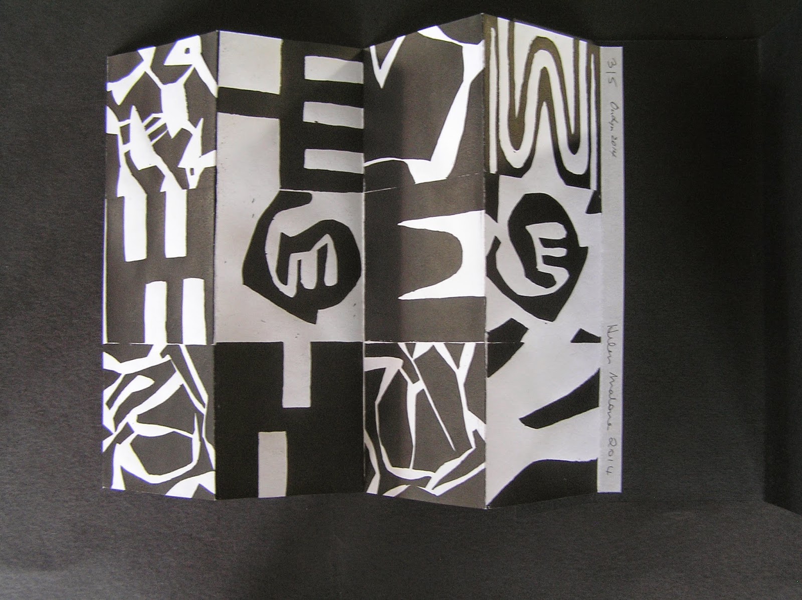
We wanted the book to be a bit sculptural and we both agreed on including a void, which clarified our ideas about what we each believe happens after death and the definite decision that the void should lead nowhere.  We cut spaces of descending size into card folded into a concertina to give it perspective and enable the viewer to look down through the void which was closed off at the end with the black card.  

Around this time we discovered Sigmund Freud’s essay “The Future of an Illusion” in which Freud argued that an afterlife has no basis in science, is wishful thinking and a disavowal of reality. This reinforced the idea of our ‘void’ which had became a series of portals that lead nowhere.

 I was interested in the immediate changes in the early days after death, and Jack had already started his experiments with decomposition, so it fell into place that I would work on a concertina which focused on the early stages and Jack would work on a concertina focusing on later stages of physical decomposition.   
On the outside we used the blue/grey/green/silvery colours of the outside of the dead body.


On the insides of the concertinas, like the inside of the body, we used reds and vivid colours.  


The materials we used for the concertinas were acrylic, soluble carbon, gouache and ink on Arches 185 gsm watercolour paper. We each made four originals.

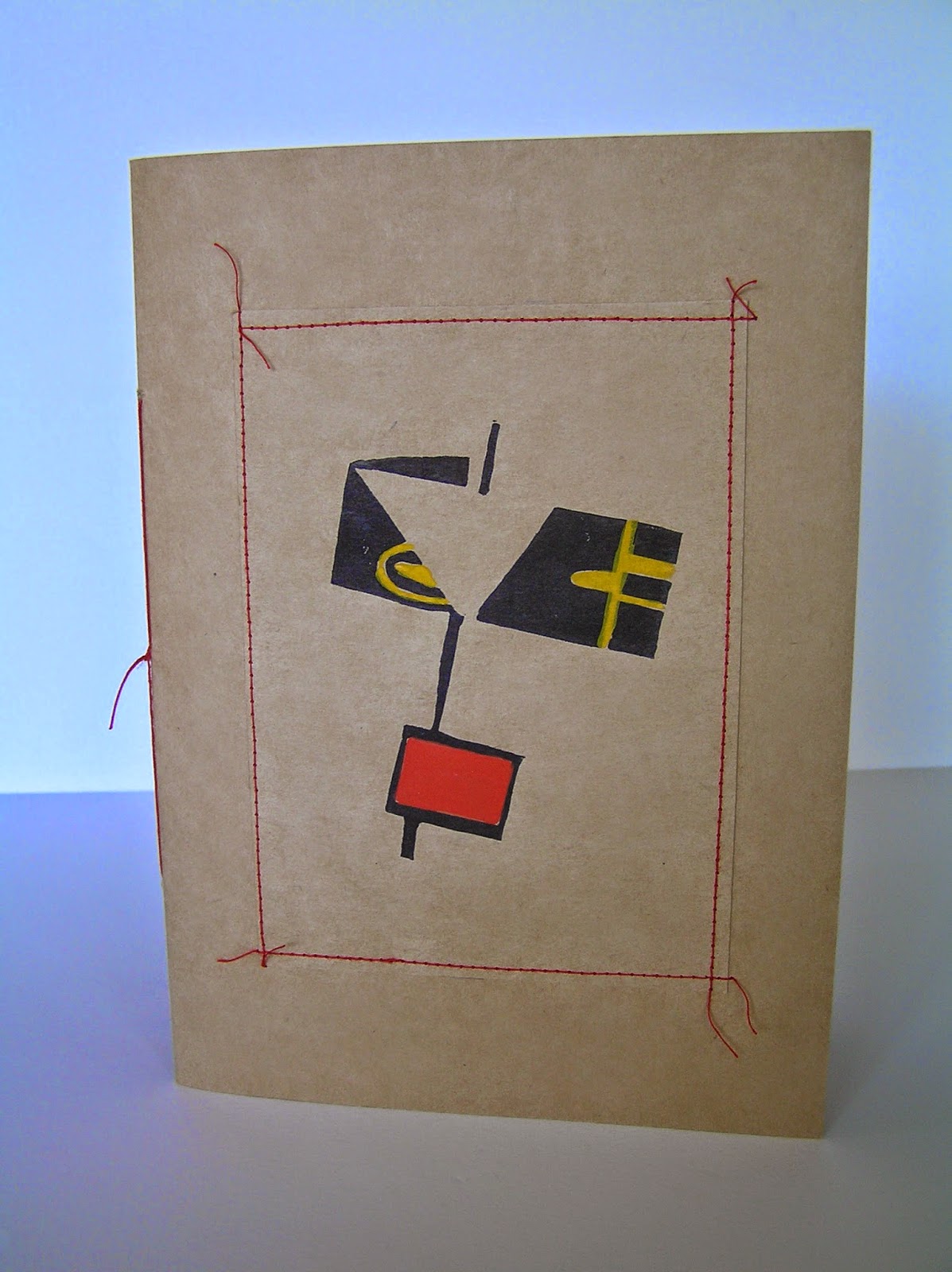
We wanted the book to look a bit scientific and Jack came up with a great method for image transfer which allowed us to use anatomical drawings. 


 I included a skull as an art historical reference to the Vanitas Still Lifes of the 17th century which reminded the viewer of the transience of earthly existence.  Lines of text were randomly placed across the concertinas and the phrases were sourced from Being Dead by Jim Crace and The Future of an Illusion by Sigmund Freud. 

 Our structure was complete  with a painted concertina sewn onto each side of the void concertina  structure, 


We had great ideas for presentation – things like a zippered body bag made of black plastic, but in the end, due to the shape and fragility of the book, we opted for a more protective four flap folder. 


 Jack had managed to come across some ‘skull’ buttons when he was in Tasmania recently and they were perfect for the closure of the folder.

Saturday, 1 August 2015

Slim Chance


Last year I was very fortunate to work on a collaborative book with Jack Oudyn called Chance.  We really enjoyed working on that project and we'd both found the working method of the collaboration quite exciting.   We decided to use the same method and follow it up with another book related to 'Chance' this year.  We had been hoping to have it finished for the SLQ Book Fair in late June, but unfortunately I wasn't able to finish my pages in time due to the death of my mother.

Jack and I had been talking about the plight of refugees no longer being resettled in Australia and facing very uncertain futures.  We found this an interesting 'chance' topic and decided to use the same Kraft brown paper for the pages and the same Kraft card cover in a dos-a-dos format. Once again we exchanged alternate lines of text by email and  both responded with a drawing.  We agreed to use fresh turmeric, gesso, gouache, pencil.

Jack had used fresh turmeric in his work previously and suggested that we try using it and making a book which had an exotic spicy odour.   We found the pages did have a nice smell when they were finished, but even after keeping them in a sealed plastic bag, after a week or so the odour disappeared.  However the fresh turmeric was interesting to use as an art material and Jack used it very successfully in his work.  This is my favourite page of his, one I find powerful and beautiful.

A choice of freedom or death.  Jack Oudyn 

I experimented with turmeric but used less in the end as I wanted the blue of the sea to be predominant in my pages.   I started with the chance marks that resulted from a chopstick dipped in gesso and some of them looked a bit like jellyfish.  I had hoped they'd give some idea of movement through the water. One of my pages was inspired by a shot in the intro to the tv show The Vikings.

 A risky journey in a leaky boat.  Helen Malone

A choice of freedom or death.  Helen Malone

Jack produced some wonderful restrained drawings and I am so impressed with the way he was able to abstract the theme.  We included two lines from the second verse of our national anthem which say  For those who've come across the seas
We've boundless plains to share.

We've boundless plains to share.  Jack Oudyn

For those who've come across the seas.  Helen Malone

On each of our pages, there are a couple of words that have been translated into one of  a number of different languages.

 A land of hope on the horizon.  Jack Oudyn

For the cover, Jack made little embossings of a boat to which we added colour and he also found some reflective material to use for the cross.
Last time we made only one original of Chance which was acquired by the Manly Library in Sydney, however this time we thought ahead and made four originals, and I think two of them will remain in our own collections.
  

Friday, 27 February 2015

An Al-Mutanabbi Street Collaboration

The Presence and Absence of the Light

I participated in the Artists Book section of ‘Al-Mutanabbi Street Starts Here’  Project with a book called ‘Absence’ and when the call came out for the printmaking project called ‘Absence and Presence’ I was delighted to have the opportunity to explore this idea of the destruction 
of culture further.


I spoke to an artist friend, Jack Oudyn, with whom I  have collaborated on projects in the past, and who also intensely supports the rights of freedom of speech and democracy.  We felt that if we collaborated on the print we would be making a statement about support and solidarity between artists, particularly our fellow artists under threat in Iraq.  After much thought and discussions about freedom of speech, around the time of the Charlie Hebdo massacre in Paris, France, we started work on the print.  Since that time there have also been reports of the destruction and burning of books in Mosul in Iraq.


The print is a combination of two prints, the first is a linocut of an Islamic screen which has openings to let in the light of the world, culture and literature, and others that are blocked by an aggressive arrow pointed shape moving across the screen.


The second digital print of abstract asemic writing underlies the first print.  It also contains the jumbled letters of the words Al Mutanabbi Street Starts Here, but only fragments of the print are visible through the openings in the screen, and these letters do not appear in their entirety in the displayed print.


The composite print has a 3D element in that the openings in part of the screen have shutters (or perhaps book covers) that need to be opened when the print is on display.

Five of the edition of  ten prints of  The Presence and Absence of the Light are on their way to the United Kingdom and the United States for inclusion in the 'Absence and Presence' exhibitions held as part of the Al-Mutanabbi Street Starts Here Project.

Sunday, 30 November 2014

The Same but Different


Minus Plus Equal (- + =) is a collaborative project I've just finished working on with Jack Oudyn, who has also posted about this collaboration on his blog. 
Like our previous collaborative book Chance, this collaboration was inspired by a talk given at the State Library of Queensland earlier in the year, by two visiting German book artists, Ulrike Stoltz and Uta Schneider, who work collaboratively as USUS.

We began by individually making ten abstract linocut blocks, each measuring 7 x 7 cm. and mounted them on single wooden blocks that Jack had very kindly prepared in advance.


We each printed off our ten small prints.  We met and alternately chose one of the prints until we had put them together into a compilation of 12 squares.


Many experiments ensued as we tried to find the best way to print the compilation.  Inking them and lining them up to print individually was tedious and difficult, so Jack mounted the twelve blocks together on a board.  Neither of us has a press and we are both interested in simple hand-made methods of production.  The compilation block was printed by hand using wooden spoons.  The first five prints were in black ink on white paper.


The second five were printed in white ink on black paper.


We marvelled at the differences and optical illusions of the black and white combinations and the positive and negative space.


The title "- + =" came from the progress of the work, subtracting from the block to add to the alternative colour, and how although both prints and paper sizes are equal, when they're side by side they do not appear to be so.


They were then folded and mounted into both black and white folders I had made and linocut prints of the title Jack had prepared were glued on to each folder.

The final task was to construct Perspex boxes to house each pair of black and white prints in our edition of five.

Saturday, 23 August 2014

A Collaborative Book about Chance


Earlier in the year an artist's book talk took place at the State Library of Queensland, by two visiting German book artists, Ulrike Stolz and Uta Schneider, who work collaboratively as USUS.  I attended the lecture with my friend Jack Oudyn and we were both so impressed and excited that we went home inspired and wanting to work on something a little different to our normal work.  We emailed each other and agreed to work on our own collaborative piece.  

We had looked at a 'Fluxus' exhibition in GOMA before the lecture and had noted some chance happenings and coincidences on the day.  In fact there were so many 'chance' happenings around this event  that we felt compelled to make our book according to the laws of chance in the style of early 20th Century German Art. It immediately seemed appropriate that our pages should be of brown Kraft paper rather than expensive art papers. USUS had worked on a book arising from exchanges of text by fax, and  Jack and I liked this idea, thus our starting point was an exchange of alternate lines of text by email, each line relating to the previous one and each linked to ideas of chance and 'chance' in art.  Our starting line of text was Chances at an exhibition.


We both completed a drawing when we received our new line of text and we didn't see each other's work until a set of ten drawings each was completed a few weeks later.


We were pleased to find that the book was going to come together really well and that we had used the same materials - gouache, pencil, ink and collage.  I had also used rubber-stamped German words, which I subsequently added to Jack's pages.  We had intentionally left space for additions to the drawings so we swapped booklets and worked on completing each other's drawings.


 This was really nerve-wracking and I was very nervous about working on another artist's work.  We were also a bit nervous about how the other person would change our drawings but we needn't have worried - we were both so pleased with the results and agreed our original drawings were improved.  I think that trust is a big part of a collaboration like this, and now we both have no doubts with our current collaborative and as yet uncompleted project.


Initially we thought that we might mix the pages of our work by interleaving them throughout the book, but in the end we decided to keep each set intact in a dos-a-dos book which worked with both ends as a starting point. We used Kraft card for the cover and Jack made the gorgeous linocut which was printed on both ends and hand-coloured.


We experimented with copying the drawn pages and made up a few more books so we could at least keep one each.  I think in future on a similar project we would make a few originals at the same time to cover a copy each and perhaps one or two for exhibition and sale.  

Saturday, 7 September 2013

A Collaborative Book


It's a very exciting prospect to have the opportunity to work on a project with another artist whose work you really admire, so it's been a wonderful experience to work on a collaborative book with Jack Oudyn.  We had met each other last year after joining Book Art Object.
 
 
The project came about after Jack's visit to Central Australia and he felt he'd like to investigate a more sculptural approach in an artwork about Uluru.  We shared similar feelings about respecting the laws and culture of  the Aboriginal people and not climbing Uluru, but as I have not visited Uluru, Jack took responsibility for the content of the book and I played with the structure and binding.
 
We started out with some general ideas, neither of us pushing our own kind of work too much and seemed to be working with something that was somewhere in the middle and not really representative of our individual work.  We seemed to not be getting very far with it, so we ditched those ideas and started again.  We each produced something individually with a view to seeing if we could combine our strengths and make the piece work.
 
I produced a couple of different structures with folded pages and Jack produced a couple of different beautiful waxed surfaces made up of drawing, collage and painting.  Please see Jack's blog as more details will be coming about the artwork on the pages and his gorgeous painted paper covers.  The different elements from both of us seemed to fit together easily and the problems we encountered were solved, so we set to work putting the books together and made a small edition. 
 
 
 The result is Paper, Scissors, Uluru.   
'Respect our laws and culture.'
 
 
The book can be held in the hand and the pages opened out completely
 

or it can be displayed sculpturally, visually suggesting the glowing and changing colours of Uluru.
 
 
I designed a little slipcase for the book to slide into
 
 
A very enjoyable experience I hope we may repeat sometime in the future.