Showing posts with label techniques. Show all posts

Tuesday, 10 February 2015

Family Secrets


Family Secrets, begun in early 2014, has been sitting almost finished on my desk for most of last year and I recently decided to do the small amount of work required to finish it off.  I had originally thought I would make it for Robyn Foster's exhibition Personal Histories, but later changed my mind when I decided to make The One Pound Pom.

I'd made a Victorian Puzzle purse structure for my Christmas card in 2013, and was inspired to use this structure in another way.  I liked the way that even when you opened out the first folds, there was a second closure to be unfolded and it seemed very secretive.


I cut very large sheets of Arches paper and stained them with a mixture of tea and walnut ink to give them a very foxed aged appearance.  I made four puzzle purses and mounted them onto four pieces of heavy card covered with brown Canson paper.


These were then mounted onto a long aged and daggy piece of leather whose three edges I had folded and glued. The four segments then folded inward onto each other 


The fourth edge was the natural edge of the skin and had a pleasing shape which ended up on the front of the folded structure and was tied with a thin strip of pink leather, looking like something I could imagine having in a drawer that did contain letters or family secrets.  This was where I got to when the project was abandoned last year.


 I needed to make some little secrets to go into the puzzle purses, so I decided to make a small folded booklet for each.  I searched the internet for fonts that were attractive visually but difficult to read.  I envisaged something thin and tall.  I found just the thing I was looking for with a font called 'Disclaimer'.  I searched the family history and printed out a couple of facts that the family would have tried to keep secret in days gone by.


The book can be displayed with just one purse opened or can look quite stunning when displayed with them all opened with their booklets - and yes the secrets can be deciphered.


Thursday, 5 February 2015

The One Pound Pom


One of the first tasks of the New Year has been to finish off  two books that had been made last year but were sitting with some details unfinished.  One of these was the book I made for the Personal Histories Exhibition of 100 books organised by Robyn Foster and which will take place from the 29th March to 10 May at the Redland Art Gallery in Cleveland.

I wanted to delve into the family history and make a book about my husband's ancestor, Timothy Dempsey, who was transported to Australia in 1821 after being found in possession of a forged one pound note, which I guess was a fortune in those days.   Timothy couldn't read or write, so obviously he wasn't the forger, and was no doubt a young man leading a miserable life in Wiltshire in England (though he was originally from Cork in Ireland). 

Despite all the hardships he would have faced being on a prison hulk in Portsmouth for many months and then surviving the trip to Australia on a convict ship, overall it turned out he was quite lucky.  He was sent to the Bathurst region to work on the farm of Henry Fulton and was given a Ticket of Leave after seven years which allowed him to move around the district freely and to work.  After another seven years he received his Certificate of Freedom.  He was granted land, married and had a large family and after his death was buried in the biggest most impressive vault in the local cemetery at Blayney.  Not bad for someone who would have continued a poverty stricken miserable life in England.

How to tell this story visually?  The most intriguing idea for me was to somehow make a reference to the convict ship and the journey.

I have always liked the Kurilpa pedestrian bridge over the Brisbane river near the Gallery precinct, which is suggestive of a boat with all its masts and rigging and  this inspired me to think of adapting this idea into a book structure using concertina folds, satay sticks and linen thread.
I experimented with lots of random masts along the middle and sides of concertina folds, but was not happy with the result and I decided it needed simplifying.


On Arches paper I printed three important historical documents - Timothy's trial at the Wiltshire Assizes, his Ticket of Leave and his Certificate of Freedom.  To these I added rubber stamps of dates, the verdict and sentence along with details of his time on the prison hulk and convict ship.  Crosses for his signature were completed with wax seals.  I joined the docments and folded them into a concertina structure.


I inserted masts of satay sticks into the three centre mountain folds.  These were sewn in with linen thread and tied down with rigging.  The stitches formed a nice pattern like the steps of the ladders up to the sails. The trial document contained a reproduction of the one pound note in question, and this was also printed and used for the main middle sail, along with a painted Union Jack for the back sail.


I cut some copper shim and made some convict tokens as an approximation of the tokens the convicts often made from pennies and engraved roughly themselves (or they had finer ones made by one of the forger/engravers in prison with them).  I had a book from the library with photos of many of these surviving tokens (now in collections) and I was able to engrave authentic sentiments on the copper.


The final step was to roughly draw in ink and brush a simple sketch of  the convict ship and its rigging, and I liked the contrast between this crude drawing and the finely, well crafted handwriting of the documents, like the contrast between the convicts and officialdom. 


I made a folder/box for the structure to sit in, complete with ribbon and wax seal and I thought the book was finished.


Then recently I thought of how to make a cover for the book by sewing the middle valley fold onto the spine of a book cover.  But what sort of cover would you have on a convict ship?  I opted for some very rough canvas, hand-stitched and roughly cut and made two covers, but it frayed so much I had to edge it with the sewing machine.  I inserted the book board inside the covers and stitched them to a leather spine.  The last step was to stitch the middle of the book structure onto the leather spine.

Monday, 21 January 2013

The Square and Semicircle Book


A Book is like a Garden in the Pocket (1997), like the box, was made by adapting the same Japanese card structure.  I wanted to reflect geometrical parterre gardens, also a product of  ideas and ingenuity, so it was appropriate to use the square and semicircle pattern as a starting point.


Back then I was very keen to use the materials of illuminated manuscripts, and in this case I used calfskin vellum for the 'pages' and made the drawings with a dip pen and gouache.


My starting point was again the same square and circle pattern.  
I cut two squares and three semi circles out of book board.  
The vellum pages were cut slightly smaller and the spine piece in my case was about 1 cm thick. 
Because of the thickness of the book board when the three semicircles are folded on top of one another, you need to leave a gap between the square and semicircle pieces before assembling the structure, so it sits well when the semicircular pieces are folded in.
I first glued the vellum spine along its edges to the outer side of both squares.
The joins and edges were all covered in Japanese paper and the vellum pages containing the drawings
were glued onto the book in the appropriate places. 


I do a lot of work with circles and use a compass cutter which can cut circles up to 15 cm. in diameter but I also sometimes just use my favourite tool, my Fiskars scissors.


Friday, 18 January 2013

Square or Circular Book Box


The book box above was adapted from a Japanese card structure that I first saw in an old book I have called Creative Cards by Yoshiko Kitagawa, Kodansha International 1987.  The book and box above were also made a long time ago in 1997.

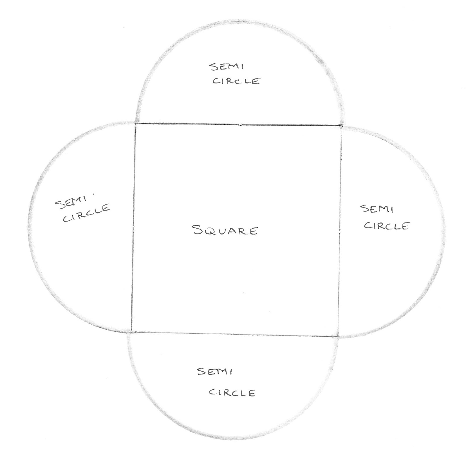
I used the card structure for my 2012 Christmas card and I will show how I adapted it into a book box.  The pattern for the card is based on a square with semicircular flaps.


The flaps are folded over consecutively and when you fold the last one you need to tuck it in under the first one and it looks like this.

The finished book box will also look like that. 

 I added the width of the book's spine to the pattern to create a box structure.


1.  The inner square should be the measurement of the book plus 4 mm.
2.  The width of the book's spine is added to create an outer square.
3.  A semi-circle is then added to each side and its diameter is the same length as the side of the inner square.
4.  The little squares on each corner are used as tabs.  You cut through the outer square on one side of the tab, and fold it on the other side and glue it to the wall of the adjacent side to form the sides of the box.  
5.  The semicircular flaps will then fold in as they did with the card and it will  have the same appearance except that it has depth rather than being flat.

(Thanks Di for inspiring me to write this post.)


Tuesday, 2 October 2012

The Simplified Binding


This fine binding style was developed by Sun Evrard in France in 1984.  Despite its name, it can be quite complex and demanding.  It differs from a traditional case binding in that the bookblock is rounded but not backed, the hollow book spine is affixed to the bookblock before the boards which are bevelled to zero at the spine side and finished before they are attached.  It is a versatile binding and can be made with clean cut edges, thus suiting a variety of cover materials.

I first learned the binding from John Tonkin of Canberra in a four day workshop in 1996.  John had studied bookbinding in Europe and had learned the binding from Sun Evrard. This is the book we made with a leather spine and leather foredge and it  contains John's instructions on how to make the binding - mine has been well used!


A few years ago I did another 2 day workshop with John and Joy Tonkin in Brisbane and we made a Simplified binding with clean cut edges and exposed leather tapes.

 
Now to continue with the binding of the four books containing my father in law's story.  In my last post on bookbinding, I had sewn the signatures of four books onto ramieband tapes.  The next step was to glue the spine with PVA, trim the tapes and then fray them out and glue them down.  The back was gently rounded and readymade headbands were glued into place.


 The spine is then filled in between the tapes with tarlatan or muslin, and a layer of paper can be added too to get the spine smooth.


I cut the leather for the spine and pared the edges as thin as I could 


The spine pieces were glued at the sides to the bookblock and then the books were placed between working boards and clamped


The boards were then cut to measure and the spine edges sanded and bevelled to zero forming a curve to fit the book block.  The cover materials were prepared and glued onto the boards.  The leather spine edges on the bookblock were pared back and sanded to remove any glossy surface in the area to be glued.  The boards were glued along the spine edge to the bookblock and the partial first sheet of paper which had been torn back to approx 5 cm.  They were then put between boards and put in the press overnight.


As I had prepared the covers to have clean cut edges rather than turned in covers, the exposed edges were painted with black acrylic paint.  The inside of the boards were infilled with the torn off piece of the first sheet to create a smooth surface and the endpapers were tipped in and glued into place.  Finally the title was prepared and glued to the cover.


Saturday, 25 August 2012

Ten Books on Architecture Part 7


My starting point for the ten books in this series has been a book structure to which I have added elements of some aspect or essence of the architect's work and this is particularly relevant with the two book sculptures Le Courbusier and Libeskind.

Around 2002 I made a couple of vellum cube books which contained divisions like chapters inside.
I liked the way they closed down to a complete white cube.  This gave me the idea to use this sort of structure for Le Courbusier, as it reminded me of his white concrete box-like villas (often on stilts).


Le Courbusier was also interested in proportional theory in architecture and saw his Modulor system as a continuation of the tradition from Vitruvius, Alberti and Leonardo da Vinci.  He introduced the modernist open plan and split level floors and made housing more affordable by using simple low cost reinforced concrete and prefabricated construction methods. 

Using heavy 300 gsm Fabriano watercolour paper, I made a box but left the back and lid section free.  The internal construction of the book has been adapted from one of Le Courbusier's internal construction plans.  The pages are like two floors that overlap but create a split level, with one shorter in length than the other, like two mezzanine floors.


As the book closes, the shorter split level floor/page sits above the lower floor/page and then closes into a white cube.

Daniel Libeskind's Jewish Museum in Berlin was built in 1989-99 and I think it is one of the most remarkable pieces of architecture.  It takes the shape of a zinc clad dislocated Star of David with a concealed entrance.  His deconstructivist work suggests fragmentation, alienation, disorientation, oppression and is intentionally disturbing. 

For this book I again made a box-like structure with angular slanted ends.  I thought it appropriate to use the skin of a once-living creature - in the first version I used calfskin vellum and this time I used goatskin parchment.  I cut pieces of aluminium shim to size, scored them with an embossing tool and attached them to the parchment.  I cut a jagged opening in the top, slit the aluminium and rounded it under the opening.


The page of text was placed into the bottom of the box and can only be read with great difficulty, either peering through the slash in the top or lifting the bookcover-like flap at the end and peering into the narrow opening of the box.


This brings me to the end of the Ten Books on Architecture.  If you have any questions about materials or techniques that I have used, please ask me.  You can contact me by adding a comment or sending me an email through the contact section of my website.

Wednesday, 22 August 2012

Ten Books on Architecture Part 6

Charles Rennie Mackintosh was an architect, designer and painter whose major work was influential around the end of the 19th century and the early 20th century. His work is a paradox of reduction and enrichment combining the rational with the expressive, and he unified the crisply rectangular with delicate curves. His Glasgow School of Art is considered the first great monument of modern architecture and a fortuitous combination of industrial Glasgow with touches of contemporary Japan.  He utilised the new technologies of central heating and electric light, plate glass and machine-finished timber, yet the decorative elements give it the appearance of hand craftsmanshhip. 

The structure of my book however is based on the design of his cabinets which show his use of reduction and enrichment and the influence of Japan, and which are displayed with the top doors open and look like the shape of a Japanese kimono.

I started with a French door book and cut white PVC to size.


I made the central page of text with lines and grids on it's covers and cut out some of the squares.


I drew some Mackintosh roses (which he often used as stained glass)
and covered with lines with gilding mix


Added gold leaf to suggest the lead lines


The roses were painted the customary Mackintosh pink and the upper lift-out pages of the book were put into place on the PVC, after the folds had been reinforced with Ramieband tape.  They were attached to the book back.


The centre page was put into position over the top page assembly.


and the front covers were attached


The next post will include the last two books in the series, the two book sculptures Le Courbusier and Libeskind.