Ed Ruscha, Every Building on the Sunset Strip, displayed
I have always placed importance on the presentation and display of my Artists Books
and I think a focus on their visual aspect creates a much more rewarding experience
for the viewer and is an important part of the genre.
for the viewer and is an important part of the genre.
I was recently in London and I saw some copies of Ed Ruscha's books displayed
for sale in two different locations.
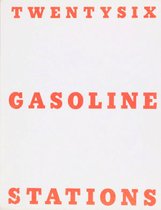
In one Twentysix Gasoline stations was displayed closed in a glass cabinet and
in the other it was also in a glass cabinet and opened at a one page spread.
I have seen Ruscha's books before always displayed like this or
showing little more than a couple of pages.

Ed Ruscha, Book cover
I attended The American Dream Pop to Present at the British Museum
I attended The American Dream Pop to Present at the British Museum
(more on that in another post) and I was delighted to find
Ed Ruscha's Every Building on the Sunset Strip from 1966
Ed Ruscha's Every Building on the Sunset Strip from 1966
unfolded to its full length of 7.6 metres and displayed along one long wall.
I had never seen any of his books displayed like this and it made such a difference
to get the sense of the buildings opposite each other stretched out along the strip
and walk the length along it viewing it.
Overall it looks also very much like car tracks along the paper.
It brought the book to life and made viewing it a fantastic experience.
It was great to see such a perceptive display from the Curators at the British Museum.

6 comments:
Snap! I, too, feel let down by some galleries' display of certain books. Sometimes, space is limited, but I always recall your "River" book, which was displayed as you'd intended at Artspace.Well, as near as possible on a small plinth.
And I was delighted to see, at a small English gallery, a pop-up on open display to allow people to open and close it.
I confess I often question the value of going to exhibitions of artists' books where books are displayed closed or showing only one page/spread. I firmly believe that the viewer needs to be able to see the entire work and if interaction with the work is a key aspect of the artist's concept, then that needs to be accommodated. Some artists' books are designed as sculptural works, but many are not. I really think galleries need to work with the artwork - they wouldn't dream of displaying an exhibition of paintings lit by a single fluoro tube in the centre of the room.
Hello Di, Yes I was very pleased when Artspace Mackay exhibited that book as I intended and it's wonderful to hear that you were able to open and close the pop-up book. We do realise that space can be an issue, but maybe this means that the galleries are trying to show too many pieces than they can display properly and having closed books crammed into cabinets is pointless.
Hi Amanda, Well said - galleries wouldn't display paintings in such a manner. I guess that it's one of the reasons I try to include a sculptural component within the structure of a book if I can to at least give it half a chance. There's usually lots more to see on closer examination though. I think generally the dedicated Artists Books Exhibitions like the Libris Awards at Artspace Mackay do a pretty good job.
Hear!Hear! It is hard to understand why artist's books are so often poorly displayed. It is so informative and exhilarating to attend a well presented exhibition like Libris. Even when you leave instructions of how you want to display your book, it seems too difficult.After your photo Helen, I have a totally new insight into Ed Ruscha's work and can't wait to see a whole extended view.
I agree Jack, seeing that display does give you a new insight and appreciation for Ruscha's work. I had never fully understood the visual concepts Ruscha was playing with within the format of a concertina book way back in 1966, as I had never seen one extended to its full length.
Post a Comment