Friday, 10 December 2021

Merry Christmas

Every Christmas for about thirty years I used to make handmade Christmas cards to exchange with many friends who also did the same thing.   Sadly, in the past few years most of us have stopped doing this.

It seems that the most popular of these cards were two that I made in 2004 and 2005 from perspex.

In 2004 I etched a piece of perspex with a Christmas tree and finished off the edges with some copper foil that I used in stained glass making. 

 In 2005 after etching the perspex I glued on an arch-shaped fragment from a canvas painting to form a stained glass window.

   Holes were then drilled and fishing line attached to enable the cards to be hung. 

While many paper/card Christmas greetings tend to get thrown out after Christmas (or go into recycling bins) it's very pleasing to know that these two were kept by a number of people and reappear every year as a Christmas decoration.

Merry Christmas 2021

Sunday, 14 November 2021

The What and Why

     I received a request from Sarah Bodman, Senior Research Fellow for Artists Books at the University of the West of England, Bristol, UK about my book That Unbearable Lightness.

This book was made in 2012 as part of the Book Art Object Project.  A complete set of BAO books made by participants were sent to Sarah Bodman and are held in the Bower Ashton Library at UWE.     


Library and teaching staff at UWE have had the idea of making some short one minute videos about  some of the artists' books in their collections to use as a teaching tool so that students can get an idea of 'the what and why' of these books.  On the proposed videos, Sarah plans to handle the book whilst talking about it and the artist's practice.   The videos would then be published on the library website and be readily accessible by the students.

 I was delighted to be asked permission for my book to be filmed and to be included in such a great resource for book arts students.

I wrote some posts about the making of this book back in 2012.   

You can find them here (working on structure) here (the concept) and here (making the book).


Monday, 6 September 2021

From my collection - 'Cacophony' by Ed Hutchins


I was excited to receive a copy of this new sculptural book from Ed Hutchins recently, a new release in 2021 from Editions, his small press which publishes his artists book multiples.  
Cacophony is a first edition of 200 copies.  It is quite large, about the size of an A4 page.
  
It went on an unusual journey from New York via Tokyo on it's way to Australia.  Due to the pandemic there are not so many flights in and out of Australia but I guess there were lots of planes flying in and out of Tokyo during the Olympic Games!  It went off the tracking radar but fortunately it did arrive at my home eventually in perfect condition.


Creating sculptural books whose structure and form relate to the theme or content of the book is a characteristic of Ed Hutchins' work and something I've always been interested in.  Ed's work definitely influenced me to consider structure as an essential element I could use to visually complement the content and create added meaning in artists books.  

Cacophony has a complicated structure made up of two intersecting concertinas that fold down flat.  The concertinas have cut-outs and irregular cut edges, with words seemingly popping up at you from every direction.  


 The book is laser printed from Ed's artwork and as the different panels intersect with each other, it must have been a very exacting procedure to have part of the artwork at the intersection on one panel and the matching part on another panel.  Absolute precision would have been required. 
 The T D and P seen below are examples of letters printed on two separate sheets of card and meeting precisely.


The concertinas contain 127 words that express sounds and exclamations.  Their intersecting nature  allows all the words to mix and mingle inside and out and some of them pop up or out at you visually creating the idea of a cacophony.  

A card accompanying the book contains a list of the words included as the text. 


WOW was my first impression and a cut-out freestanding Wow has been inserted into slots in one of the cut-out circular areas on the front side of the book and takes the word count to 128! 
Ed has created a colourful, joyful masterwork that makes you smile.   
 
A video posted by Ed Hutchins on You tube displays the book moving in the round here.
You can also find a number of other teaching videos on You tube where Ed demonstrates how he worked on different aspects of this masterpiece of construction. 

Saturday, 14 August 2021

Intertextuality

 Intertextuality is the juxtaposition of two texts which together create a new meaning that is not contained in either text when used alone.  The term was introduced by semiotician Julia Kristeva in the late 1960's.  It has much potential for use in artists books and I think it could and should be a method used by artist book makers more often.

I first used intertextuality as a means of creating meaning in an artwork I made in 1993.

The piece was a sculptural book made of calfskin vellum called In the Beginning Far off in the Dreamtime.  The form of the book is an icosahedron - a crystal shape created in nature.  This icosahedron carries excerpts from two different creation texts, In the beginning from Genesis in the bible and Far off in the Dreamtime, the story of the Rainbow Serpent.  By juxtaposing the texts, meaning and issues not contained in the individual texts were created, relating to Australian/Aboriginal cultural issues, reconciliation and belief systems.


This artwork was purchased by the State Library of Queensland in 1993 after being included in an exhibition at the State Library.  It is now held in its Artists Book Collection.  It was also included in a book by Kay Saunders Between the Covers: Revealing the State Library of Queensland's Collections, Focus Publishing NSW 2006 p. 147

Another example of intertextuality is the work of British digital artist and printmaker Phil Shaw who has used intertextuality in a series of digital prints he has been producing for over ten years called Bookshelves. When the viewer reads the titles of the books in sequence, they connect with each other and create a new text and meaning.

A recent print of his called Shelf Isolation 2020 utilises these book titles to create a new story about the pandemic.  

Image and text below Copyright Phil Shaw

The titles of the books read
The English Patient/Had/Caught/It/On the Beach/I should have stayed home/She said/Now/She was/in Quarantine/In the Dark/House of Splendid Isolation/Still/Hope Springs Eternal/With a little bit of Luck/Common Sense/And/Personal Hygiene/The Corona Book of Horror Stories/Must End Soon/Always Remember/Clean Hands Save Lives/And/When in Doubt/ Don't/Go/Out.

Phil Shaw has made a number of different Bookshelves in this series and you can read how he creates the prints and view others in the series on his website here or at the Rececca Hossack Art Gallery in London here.  

Saturday, 31 July 2021

From My Collection - 'Edge' by Jack Oudyn


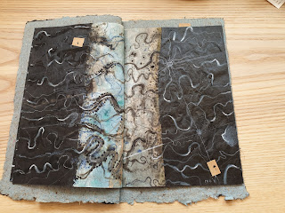
One of the most beautiful books in my collection is Edge, an Artists Proof by Jack Oudyn.

The book is A5 size and contains 6 double sided leaves. It is bound along the outside edge of the cover in Japanese style. The handmade cover paper is made from grasses and plant fibre of the type that would be found in nature.

Jack went on a trip to Kati Thanda (Lake Eyre) in 2019 when the lake was in flood with historically high levels of water. He took a flight over the lake to see the scale of it and also to view it from above.  This enabled him to create his personal impression in these wondrous images created with his own homemade mangrove and pomegranate inks, acrylic paint, coloured pencils, pastels, 
chinagraph pencils and found maps.


Jack called the book 'Edge' as a reference to the edge of the boggy and shallow shoreline which it is impossible to approach on land.  He varies the size of the dark paint on the outer edges of the pages to indicate the continually changing edges of the lake.


The pages of the book are double sided and Jack has made tabs on each spread that can be lifted from the surface image to show underlying maps of the area.  He has included a little card lifter inside the front cover to facilitate this.


I find these colours and images of nature and of our country incredibly beautiful and contemplative.  I can imagine every spread as a framed painting that would give enormous pleasure.


The interesting and amazing thing that struck me was that in his portrayal of our wonderful landscape from his aerial view of his experience and his mapping of the land, one is struck by certain aspects of Australian indigenous art. 
In a comment on his blog he says
When you are in a little plane you see our indigenous art in nature.  
They would never have seen it from the air so how did they visualise their landscape?
Yes it is a wonder of our landscape - so glad I had the chance to experience it.

 You can view Jack's blog post on this book and his comment here
 

Tuesday, 29 June 2021

Two Zines from My Collection

There was a great little gallery in Melbourne called Hand Held Gallery run by Megan Herring, which used to exhibit Artists Books and zines.  I participated in their exhibitions a number of times but sadly it closed down around 2012-2013.  

Here are two of the zines I purchased from their final exhibition.


BENEATH THE SCREEN OF CLOSED EYELIDS (PORT SAID)

by Gracia Haby and Louise Jennison

Undated but numbered 57/60, 24 pages

The pages are glued along the spine and the covers attached with pink card.


I love the name of this zine!  Gracia and Louise have taken very old black and white travel images which don't look very exciting at all (in this case images of Port Said) and altered them by the use of colour and the addition of gigantic exotic looking animals.  The animals are larger than life, the kind of visual image you could experience in a dream and the photos have been transformed. 


18.18 to 22.22
by Jan Davis  Dated 2012, Unnumbered, 10 pages

The pages are folded and stapled together through tape along the spine.

This zine is a record of a train journey from Southern Cross Railway Station in Melbourne to Bairnsdale Railway Station on Saturday July 21st 2012.  It's a kind of automatic drawing where the bumps and lurches of the train create the marks on the page.  The names of the stations on the way are inserted as well as a message about the doors failing to open.


On the inside back cover Jan provides instructions for others to make their own train drawing.
1. Board a train
2. Put the pen lightly against the page and begin a very slow line allowing the bumps and lurches of the train to affect the progress of your line.
3.  Pause your line when the train halts and record the station name,
4.  Continue until journey's end.

I haven't tried making one of these train drawings but I do know other people who have enjoyed using this method to entertain themselves while in transit.


Tuesday, 8 June 2021

Zines are Fun

 Zines are a great way for artists to give away a small piece of their artwork or to sell cheaply.

In 2012 I made my first zines, a series of two based on my love of art history.

         The first was called Guess Who's coming to Dinner?

    I started looking for an image of a painting of the Last Supper.   I found one painted as an altar  frontal (c.1230) for a church in Soriguerola, Spain and as far as I know the artist is unknown.  It is now in the Museu Nacional d'Art Catalunya in Barcelona. 


Its composition was perfect and would suit being presented on a long page folded into a concertina.  I made a line drawing of the composition in ink onto offcuts of Fabriano HP paper.         

 I  found images of twelve male artists that I like who also made an artwork which contained something relating to food.  
          The heads of the artists and a small detail of food from their artwork were copied and pasted onto the drawing.  
I then printed an edition of 50. 


 The artists included were from left to right -  Brett Whiteley, F.T. Marinetti, Paul Klee, Paul Cezanne, Andy Warhol, Pablo Picasso,     Salvador Dali, Giorgio de Chirico, Jasper Johns, Vincent Van Gogh, William Robinson, Henri Matisse.

The aim was to guess the names of the artists from the clues.

           I made a little insert to be included with the zine which contained the names of all the artists.

             A number of both zines went down to Hand Held Gallery in Melbourne which exhibited  artists books and zines.  I was pleasantly surprised to hear that one of the zines, Guess who's coming to Dinner was purchased from Hand Held Gallery by the University of Melbourne Library Special Collections.


I made the second zine in the series Guess who's not Cooking Dinner? using the same method.  I searched for another painting of The Last Supper and came up with a painting by Duccio.


 Duccio's Last Supper (1308-1311) was commissioned by Siena Cathedral in 1308 and was completed in 1311.  The double sided altarpiece is now in the Cathedral's museum.   It was a perfect composition for my line drawing and I used the same method of photocopying the heads of the artists and placing a small detail from their artwork on the table.

    This one was to be of female artists and the issue of equality.  Like the male artists these women would not have had time (or perhaps the desire) to stop work and cook dinner.


The artists I included here are from left to right back row -
 Berthe Morisot, Yayoi Kusama, Georgia O’Keeffe, Yoko Ono, Tracey Emin,
Margaret Olley, Margaret Preston, Judy Chicago

From left to right front row -  Sonia Delaunay, Frida Kahlo, Artemisia Gentileschi, 
Fiona Hall, Kathe Kollwitz


I made an edition of 50 copies again and also included a little insert with the names of the artists. 

I enjoyed making these so much it could be fun to make some more zines now I've more time to play.

Part 2 will be about some zines I bought from Hand Held Gallery not long before it closed down. 


Wednesday, 14 April 2021

A Much Loved Book


When an old friend of mine, Helen Bryant, handed me this book box containing an artists book
 a few years ago, it was obvious it had been well handled and much loved.  
Helen said she had bought it from an exhibition at the Doggett Street Gallery in Brisbane in 1994.
 
 It had been one of her favourite possessions, and she wanted me to have it to enjoy.
 She said her family would have no appreciation or understanding of it.  
Helen also returned to me two early books of mine she had bought back in the mid 1990's.  
She was an art teacher with little time to do her own artwork 
and liked to support artists by buying their work. 
Helen B died soon after that day after a long battle with breast cancer.
It is a lovely reminder of her to have one of her little treasures. 

Imagine my surprise when I discovered that the box contained an artists book 
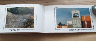
called Containers made by a friend of mine, Jack Oudyn, back in 1993-4, before I knew him.
 
The book measures 15 x 8 cm. has a Japanese binding, and 25 double pages.
Jack has used a combination of photography, collage and drawing, techniques
 often seen in his artwork.  Some of the pages
 have lift up flaps cut into the photographs to expose underlying text or images.
Here are some of my favourite pages from the book.


    Jack likes to play with words and this book contains a number of examples.

Couplings and Stackings

Multiples and Twins

Well Stacked and Topless

The book juxtaposes aerial views of freestanding houses, backyards and gardens, with
stacks of shipping containers.  Jack made this book about 25 years ago but it seems so 
contemporary and very relevant to the present times where inner city suburbs are
 being bulldozed and tall buildings of small apartments are filling the space.
Many of them are so ugly and the apartments so small, it would actually feel like 
living in one of these stacked shipping containers.


                                                                    The sky's the limit

                                                                           Con  tainer
                                                                                    formity


Hidden tiles and Tile (Hidden)  (ITEL)


Well we all know the priorities of the developers and the City Councillors who
always seem to cave in and allow the developers to break a few rules and add
another floor or two above the established height limit, previously enforced,
thus maximising profits for both parties.

I plan to post about one of Jack's more recent books in my possession in the near future.