Friday, 17 August 2012

Ten Books on Architecture Part 3

Two books based on the Turkish Map Fold, Brunelleschi and Queenslander


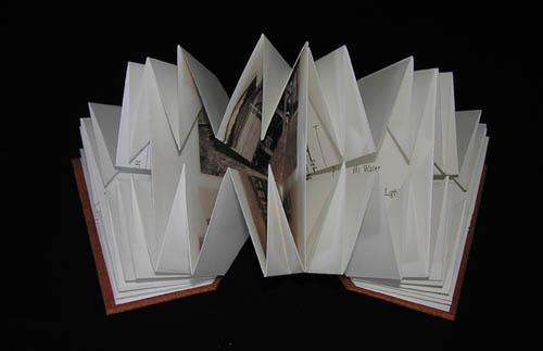
Queenslander is a pretty standard multi-paged Turkish Map Fold book.  I chose the structure because in this book I wanted to include floor plans, pictures of a timber old Queensland house being built, a drawing, and to tell how many of these houses were War Service Homes, built for men who had served in WWI. This book tells of one particular house that used to be called Clutha.


I like the way this book looks like a little house when it is closed and I used some wood veneer paper (papier bois) for the covers.


Brunelleschi refers to the dome of Florence Cathedral, which was an outstanding engineering achievement which combined Roman Construction techniques with Gothic rib vaulting principles.

Instead of folding the paper with the cross point in the centre, I folded it off centre


and ended up with a shape like this


which was then cut to the shape I wanted


White PVC ribs/covers were cut to size and the edges were sanded to make them smooth and rounded


and the folded pages were sandwiched and attached one by one between the ribs.


The cathedral and its interior are decorated with green and white marble and I wanted to reflect this in the piece.  I cut circles of green paper which were to be overlaid with circles of white paper containing the texts and cutouts of details from the cathedral and interior of the dome.  These pages were folded into a standard Turkish map fold and the green pages were fitted into place and attached to the book and then the white pages were fitted and attached.


The patterns used for the white cutout sections were things like the opening of the lantern looking upwards, the decorative pattern of arches, and the rectangular green and white marble pattern - shown in perspective, and fitting for  Brunelleschi as he was responsible for formulating the laws of linear perspective.


In the next post I will talk about two perspex books, Mies van der Rohe and Pei.

Tuesday, 14 August 2012

Ten books on Architecture Part 2


The ten books each have their own slipcase or box and are contained in a large box.
The architects and works included in the piece are not a totally structured history and development of architecture, but include things that interest me.

In this post I will talk about Book No 4, Alberti.  To Vitruvius' three qualities necessary for perfection - Utilitas (Function), Firmitas (Structure) and Venustas (Design and Beauty), Alberti added Numeros (Numbers), Finito (Proportion), Collocatio (Location or Arrangement) and Concinnitas (A well adjusted whole). Alberti's architecture is constructed according to proportional theory and he uses classic arches and columns decoratively rather than structurally. 
 For this reason I decided to make the book look a bit like a facade.


As a background to the pages I used illustrations of Alberti's architecture showing how the proportional theory worked in his designs, and I also found some facsimile pages from Alberti's 'Ten Books' (in Latin) and I made faded grey copies of these in Photoshop.


Each page contains overlaid text of important points about architecture from Alberti's ten books De re aedificatoria.  The printed pages were assembled with a folded gutter between each page to give the raised effect of the facade.


The covers were made from white PVC.  I used this a lot around 2005-2006 as I liked the solid white appearance.  After cutting the covers I sanded the edges to make them smooth and rounded.  A blind design based on Alberti's proportional theory was drawn into the PVC with an embossing tool.


The next posts will be about the two books based on the Turkish Map Fold, Queenslander and Brunelleschi.

Saturday, 11 August 2012

Ten Books on Architecture


I've just finished working on Version 2 of the Ten Books on Architecture.  I had received an enquiry from The Pratt Institute in Brooklyn, New York as they were interested in acquiring the piece for their Artists Books collection.  I made the original piece in 2006 for the Noosa Books tenth anniversary exhibition and it had sold there, and I had never made the intended extra two versions.  However, I had all the texts and images on my computer, and notes on sizes and how I made the books in my notebook, so I offered to make Version 2 for them.   I think it may be a good idea to work on Version 3 while it is still fresh in my mind!

The Roman, Vitruvius, wrote the first 'ten books on architecture' called De Architettura around 40 BC and then in the Renaissance, Alberti was influenced by Roman architecture and wrote the second ten books on architecture, which he called De re aedificatoria in 1452.   My ten books on architecture references these two works and uses architecture as an analogy for building a book structure and expresses the essence of the work of ten different architects or works of architecture.

I've decided to post about the making of the individual books in this piece as I use a lot of adapted structures and various techniques. I won't necessarily follow the order of the books in the bookwork, as I will talk about similar pieces together, but I will start with Book 1 which is Vitruvius.

The Vitruvius book is adapted from the The Roman Alphabet book which I made in 1993.  This concertina book opened out like the frieze on a Roman temple with the cutout embossed letters creating the relief sculpture.


With Vitruvius, I again painted Arches WC 200 gsm paper with watered down Sumi ink to create a marble like effect, which was made into a concertina book.
I made an embossing plate of a simple Doric column from mat board, which I then hand-embossed a little inside the edge of each outer fold.


I then cut the folds and cut out around each column.


The back page contains text relating to the essential elements of architecture according to Vitruvius - Utilitas (Function), Firmitas (Structure) and Venustas (Design and Beauty).  The book resembles a Roman temple when standing opened.


In the next post I will talk about the Alberti book which is another concertina type structure.


Tuesday, 31 July 2012

Zine Give-away


After receiving zines from Amanda, Jack and ronnie, and a lovely bookmark from Robyn, I've made my first zine.  It's called Guess who's coming to dinner and involves guessing the identity of the included artists - some are easy, some more difficult and one quite obscure.

So if you'd like to receive one just email your postal address to me by going to the 'Contact' section of my website http://www.visualartist.info/helenmalone and you'll receive one in the mail.

Wednesday, 11 July 2012

You can never have too many books


Shakespeare and Company is situated in rue de la Bucherie in the 5th arrondissement of Paris, and is a wonderful location for any book lover to browse, read and leisurely spend some time playing chess or the piano or writing that new novel.


Besides standing on traditional bookshelves there are books jammed into every nook and cranny.


The original store was opened by the famous American Sylvia Beach in rue Dupuytren in 1919.  She was one of the remarkable women of the twenties, who among many other achievements published James Joyce's Ulysses.  

                 I'm currently reading Sylvia Beach's biography

          which I bought at Shakespeare and Company of course.

Saturday, 7 July 2012

1000 Artists Books


I arrived  home from Paris to find my copy of 1000 Artists Books waiting for me, and a luscious book it is.
I was pleased to have two books from my 2011 Disaster series included in the book, Tsunami and Shattered in the Shaky City.

I wanted Tsunami, evocative of the black waves of water rolling in over the landscape, to have a Japanese minimalist aesthetic.  I soaked Japanese paper in Sumi Ink and water, stitched the variable length scrolls together with a simple Japanese stab binding and presented the book in a leather roll.


With Shattered in the Shaky City, my idea was to show the city of Christchurch falling apart and lying as rubble on the ground.  When the book is extended it looks like this


This view of the book is of a later version with the addition of text which is slipping down and falling into piles in the folds and crevices.

1000 Artists Books is published by Quarry Books in the USA. The images on the pages do look clean without a lot of clutter, but I would  have liked the book title to have been included with the artist's name on the page with the image, rather than having to consult the index at the back.   I haven't examined the book thoroughly yet, but have noticed so far the work of other Australian Book Art Object artists, Gail Stiffe, Terence Uren, Sandra Winkworth, and a Melbourne book artist friend Marianne Little.

Saturday, 9 June 2012

Days of Books in Dublin

I've been in Ireland for over ten days now and I've spent quite a few days in the City of Literature enjoying the booky delights on offer.

A high priority was to see the real Book of Kells which has been so familiar in reproduction.  It is housed in the Old Library of Trinity College with the equally stunning Book of Armagh and Book of Durrow.  The Long Room upstairs had many other illuminated manuscripts and Book of Days on display. It was the most amazing library I have ever seen with over 200,000 beautiful very old leather bound books in the shelves.

A real highlight for me was having the opportunity to visit the Chester Beatty Library in a part of Dublin Castle. Displayed over two floors, the first level is devoted to the art of the book and the second level to religious texts and books.  Such a wonderful collection of historical books ranging from fragments of an Egyptian Book of the Dead, illustrated Chinese and Japanese scrolls, beautifully illuminated Islamic books and Korans, Greek manuscripts, European illuminated manuscripts and Books of Days, other Asian concertina books, beautifully bound leather books and bindings, etchings by Goya and engravings by Albrecht Durer.  It was such a delight I went back a second time.


I've enjoyed the literary ambience of Dublin with the statues of its most well known writers waiting to be discovered.  The Dublin Writers Museum was interesting and I loved a room in the National Gallery devoted to Irish artists and containing a smaller room showing paintings of locations in Dublin paired with texts by James Joyce.

Another treat was a visit to the National Library of Ireland to see the WB Yeats exhibition - a very large exhibition covering every aspect of Yeat's life and his work.  The layout of the exhibition contained a number of small rooms showing different videos.  It was very interactive and extremely well presented.  I was enthralled by a little room near the entrance where you could sit and listen to well known people reading a selection of Yeats poems which were also projected onto see-through fabric screens.   My favourite poem 'Easter 1916' was one of the poems that were recited and I sat through the whole loop to hear it a second time.  It was truly inspirational.